

Techniques for Perfect Alignment of Icons and Text in Tailwind CSS
Discover how to fix icon misalignment with text using Flexbox and Relative Sizing in Tailwind CSS
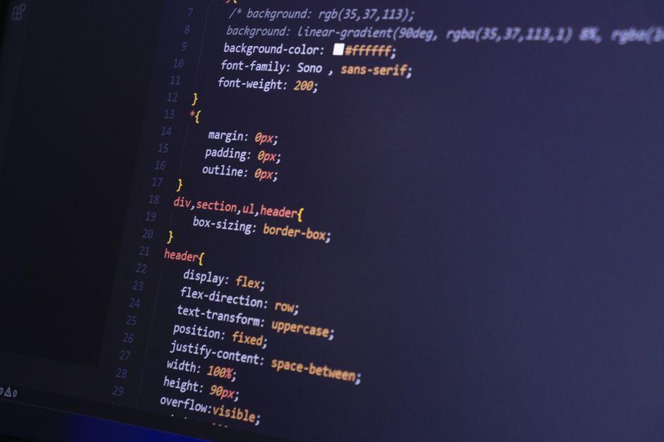
Stock photo for illustration only, not from the actual event
Many web developers have likely struggled with the issue of vector icons placed alongside text failing to align properly by default in browsers. Because graphic icons lack a baseline like typography, their shapes visibly float either higher or lower than the text level.
This article introduces guidelines for solving the layout alignment of map icons from the GeoIcons library combined with the Tailwind CSS framework, ensuring icons and text labels render beautifully and harmoniously. The main techniques to apply are as follows:
- Use a container component to set up Flexbox for organizing the icon element and text group into proper alignment.
- Adjust the icon's height to match the line-height instead of sizing it by the font size to prevent vertical discrepancies.
- Use Relative Translation classes to adjust positions to balance icon images with varying aspect ratios, such as the elongated shape of Italy versus the compact shape of France.
For practical implementation across various components, there are several interesting patterns: for buttons, use the inline-flex items-center utilities and make the icon slightly smaller than the text; for list displays, set a uniform icon size for every row to prevent unevenness; while for country input fields, position the icon using absolute positioning combined with top-1/2 and -translate-y-1/2 for centering. Additionally, if you need to inline icons within regular text sentences, you can use the em unit for width and height to automatically scale them alongside the typography.
Source: Dev.to
Found something wrong in this article? Report an issue with this article
Comments
Leave a Comment