

Designing Scalable Interactive Visualizations with Reflex XY in Python
An overview of Reflex XY capabilities ranging from million-point rendering and live streaming to portable exports.
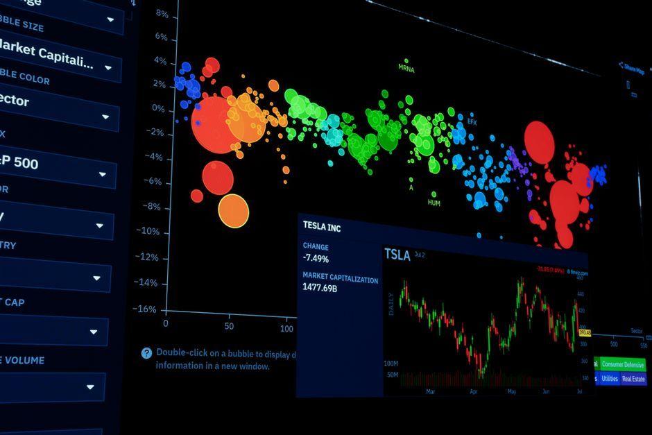
Stock photo for illustration only, not from the actual event
- Enables complex interactive visualizations directly from Python workflows.
- Efficiently handles million-point datasets and live data streaming.
- Supports themes, animations, and custom statistical mark plugins.
- Allows portable chart exports preserving interactivity and publication quality.
Developing modern interactive visualization tools often involves performance bottlenecks when handling massive datasets. Recent workflows demonstrate how Reflex XY empowers developers to construct sophisticated charts directly from Python, enabling layered and faceted visualizations for efficient large-scale data analysis.
The system excels at retrieving exact selected data rows directly from the kernel while seamlessly streaming new observations into live visualizations. Furthermore, users can fine-tune chart appearances utilizing themes, animations, CSS classes, and stable DOM slots to match specific design requirements.

Stock photo for illustration only, not from the actual event
From a data engineering perspective, rendering a million data points smoothly without freezing the user interface remains a critical challenge. Tools like Reflex XY bridge the gap between Python simplicity and frontend flexibility, allowing analytics teams to build high-performance dashboards without switching to complex alternative stacks.
Beyond standard features, Reflex XY extends its capabilities through custom statistical mark plugins and reuses familiar plotting commands via the xy.pyplot bridge, significantly lowering the learning curve for developers accustomed to traditional environments.
The workflow concludes with robust portable exports, enabling charts to be shared outside the notebook environment while preserving either full interactivity or publication-grade graphical fidelity.
Source: MarkTechPost
Found something wrong in this article? Report an issue with this article
Comments
Leave a Comment