

A Deep Dive into Animating CSS border-image for Dynamic UIs
Explore how to bring static website borders to life by animating border images using CSS gradients and custom properties.

Stock photo for illustration only, not from the actual event
- Transform boring standard borders into moving elements using border-image and gradients
- Border images do not curve with border shapes, but workarounds exist
- Registering custom properties allows us to animate CSS color gradients effectively
- Experiment with conic-gradient and border-image-repeat round for unique tiling effects
Standard solid or dashed borders can often feel dull and uninspired on modern websites. A great alternative is using an image or a gradient as a border instead, and taking it a step further by animating these border images to create truly engaging user interfaces.
There is a significant caveat when working with border images: they do not curve to border shapes. This limitation poses a challenge for animations traveling around an element, though developers can successfully work around it for specific use cases, or explore alternative approaches like Temani Afif's CSS mask technique.
Why choose border images in the first place? Key benefits include:
- Super high efficiency, especially when animating border images and gradients
- Automatic replication of designs across all borders with minimal effort
- The ability to slice images using the border-image-slice property, similar to background-size and background-position
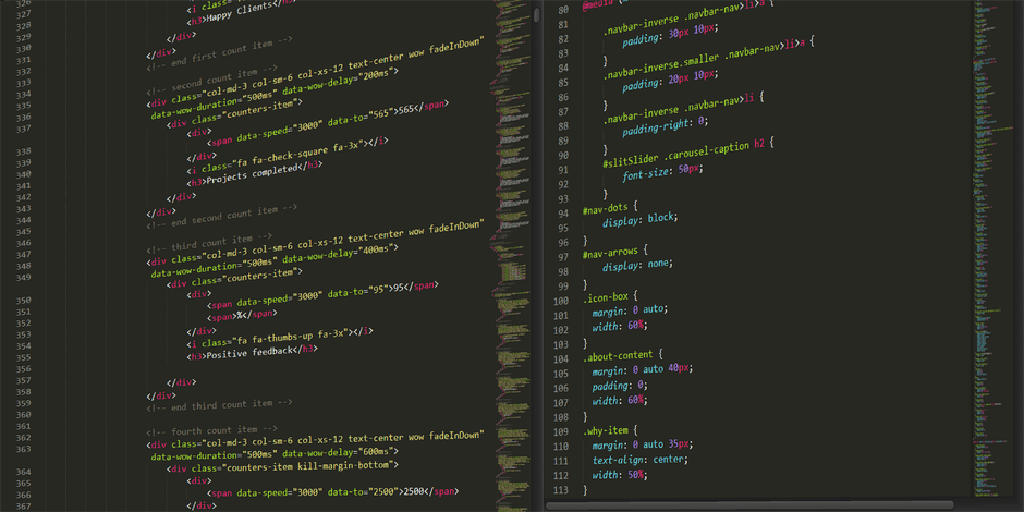
Stock photo for illustration only, not from the actual event
Animating CSS borders represents an advanced front-end technique that elevates UI design without relying heavily on JavaScript. Understanding how border-image-slice interacts with CSS variables gives developers precise control over gradient animation states, timing, and visual flow.
To set things up, we start with a simple container div with explicit dimensions and a background image. For the border itself, a single-color CSS gradient makes demonstrating the underlying animation mechanics much clearer, especially when separating longhand border-image properties.
The main hurdle with gradient animation is that browsers cannot natively transition between gradient percentage endpoints by default. This is where registering a custom property becomes essential, as it unlocks the ability to smoothly animate CSS variables over time.
Beyond standard linear gradients, developers can branch out into conic gradients, animate the border-image-slice value directly, or utilize border-image-repeat set to round to neatly tile slices along the element borders.
Source: CSS-Tricks
Found something wrong in this article? Report an issue with this article
Comments
Leave a Comment