

How Browsers Implement Native Focus Rings and Their Accessibility Implications
An in-depth look at how browsers handle native focus rings, the hidden pitfalls of custom CSS outlines, and why leveraging :focus-visible is crucial for web accessibility.

Stock photo for illustration only, not from the actual event
- Native focus rings help keyboard and assistive tech users track their exact location on a webpage.
- Removing default outlines without a proper fallback creates severe accessibility roadblocks.
- The :focus-visible pseudo-class allows custom styling for keyboard navigation without affecting mouse users.
- Modern browsers automatically adapt focus outlines based on input modality and user preferences.
Have you ever tabbed through a form and noticed a glowing outline appear around a button or input? That subtle highlight, known as the native focus ring, feels so natural that we rarely pay attention to it—until it goes missing or renders awkwardly in an application. Developers often encounter bugs where custom form styles accidentally suppress focus rings during keyboard navigation. For users relying on keyboards or assistive technologies, this oversight makes it impossible to tell which element is currently active, creating a major accessibility hurdle.
Browser focus rings are far more complex than a simple default CSS border. A surprising amount of processing happens under the hood, with different browsers rendering focus outlines through distinct internal mechanisms. Customizing these styles can easily backfire if engineers do not fully grasp how browsers manage focus states. Exploring how native focus rings operate internally, why they matter, the tradeoffs of overriding them, and practical debugging strategies is essential for building inclusive web applications.
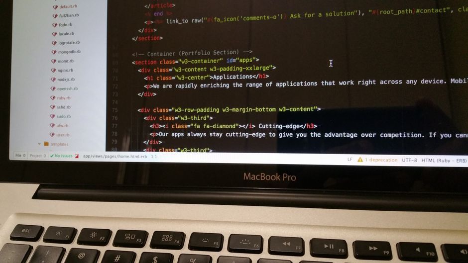
Stock photo for illustration only, not from the actual event
While designing a sleek login interface, developers frequently attempt to strip away the default outline style entirely:
- Replacing default outlines with custom box-shadows often results in inconsistent cross-browser rendering.
- Custom focus styles can intermittently disappear if an element becomes disabled or hidden.
- Native focus rings typically appear when an element receives focus via keyboard navigation, such as pressing the Tab key.
- Browsers monitor input modality using internal heuristics—for instance, Chrome utilizes a dedicated FocusRingController to track keyboard events and conditionally render outlines.
Understanding input modality and focus management is a cornerstone of meeting modern Web Content Accessibility Guidelines (WCAG). Browsers intelligently differentiate between mouse clicks and keyboard navigation to keep interfaces clean for pointer users while maintaining full functionality for keyboard users. Stripping away default focus indicators without robust alternatives severely harms users with motor disabilities or visual impairments who depend entirely on visible focus states.
Source: Dev.to
Found something wrong in this article? Report an issue with this article
Comments
Leave a Comment