

Testing Three Identical UI Interfaces Built Differently
An experimental comparison of three preference form versions that look identical visually but behave completely differently during keyboard navigation.

Stock photo for illustration only, not from the actual event
- An experiment rebuilt the exact same small form interface in three different CSS versions.
- Visual QA checks failed to distinguish any differences among the three implementations.
- Keyboard navigation via the Tab key exposed drastically different focus behaviors.
- Common CSS resets frequently strip away essential accessibility features without intent.
A recent engineering essay explored the boundary between browser decoration values with no functional weight and interactive affordances that carry real utility. The specific claim put to the test involved building three versions of a small preference form using identical markup while altering only the CSS to see how browsers handle default behaviors.
In the baseline version utilizing raw browser defaults without any resets or utility classes, headers, input fields, and buttons render naturally. Navigating through the form using the Tab key automatically triggers a focus ring around the email field, checkbox, link, and button, effectively narrating the user's exact position through the form interface without requiring extra scripting.
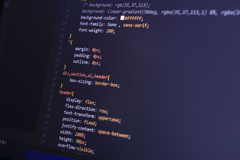
Stock photo for illustration only, not from the actual event
The second implementation introduced a standard CSS reset, a common baseline applied in many software projects before adding custom styles. When placed side by side and clicked through with a mouse, all three versions read as the exact same webpage, meaning a standard visual QA review would pass them all without detecting any discrepancies.
Understanding keyboard focus and accessibility is critical for inclusive web design. Blanket CSS resets often unintentionally wipe out default browser focus rings, leaving keyboard and assistive technology users blind to their active location on a page despite flawless visual aesthetics for mouse users.
This highlights a core flaw in traditional visual-only testing pipelines, where appearance is validated at the expense of functional interaction mechanics.
However, once the interaction method shifts from a mouse to keyboard navigation, the illusion of equivalence collapses completely. While the first and third passes continue to narrate every stop along the form, the second pass remains entirely silent across every single element.
The findings demonstrate that most HTML resets miss the point entirely. Pass one deliberately kept browser defaults, pass three intentionally designed a custom focus ring matching a design system, but pass two made no conscious choice at all, merely inheriting a side effect from rules originally unrelated to focus management.
Source: Dev.to
Found something wrong in this article? Report an issue with this article
Comments
Leave a Comment